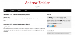
Learn how andrewembler.com uses liquid grid layouts, flexible font sizes and elastic image spacing to create a site that looks good on mobile phones as well as large widescreen monitors.
Read MoreJune 2011
I've revamped my web presence yet again. I really need to get together an archive of all of them over the years. This design is pretty cool for a number of reasons. I think anyone with a concrete5-powered blog might find some of these approaches useful, especially if it has a technical focus.
Read More
